
Refraction
“Refraction is the change in the direction of a wave passing from one medium to another.”

Project Overview
For the past few years, third-year students enrolled in the undergraduate course of Digital Design from Curtin Mauritius have been organizing grad shows to showcase their skills, talents, and portfolio to industry professionals. This activity, which takes place over two days on campus, enables students to network and interact with designers from the industry. The preparation of the event takes up the whole semester (3 months) as students are expected to work collaboratively to produce a coherent and aesthetic outcome. While we, tutors, are present to guide and provide feedback, students are required to work in their respective assigned committees and communicate their progress at the beginning of each class in the form of a short presentation.
The committees are described as follows:
The Digital Committee undertakes the development and production of the website and various digital applications.
The Video Committee focuses on the concept and production of video content for teasers, social media shorts, content during the event, and of course, the trailer of the event for its promotion.
The Communication Committee engages in content writing, invitation proposals, and venue decoration, amongst others.
Quality and Assurance Testing Committee overlooks the progress of each committee and provides feedback to maintain brand consistency.
During the first weeks, students had to come forward with name proposals and after a few rounds of presentation, the name REFRACTION was selected. This case study was created as a reference for students to understand how to translate their story to visuals that would carry meaning.
The Challenge
One of the main challenges that students faced while working on the event’s visual identity, was the lack of communication between one another and the different committees. They were all focused on coming up with the most creative logo with no concept or story attached that would provide context to the event. This resulted in some aesthetically pleasing logo design with no connection to the purpose of the event, no proper overall experience, and no visual coherence to the theme of Refraction.
During their 3 years of studies, students focused greatly on developing static identity systems for their various projects and did not have the opportunity of exploring dynamic identity systems and animation. The Grad show was finally the perfect instance to do so.
As such, this project was built as an example that encompasses storytelling, brand identity, and brand experience for an event.
Note that this is not the actual brand identity or the visual experience of the event. This was created purely to guide students on the implications of designing for events.
The Solution
Foundation of the story
While creating this case study, the following questions helped in developing a story around the students’ experiences during the 3 years they spent at Curtin Mauritius.
How to visually summarise 3 years of Digital Design at university?
How to develop a visual identity system flexible enough to be recognized as one entity, yet, show individual characteristics of the students?
How to align the meaning of refraction to the purpose of the event?
To begin the visual exploration, it was important to ground the story in actual experiences the students encountered during their course. However, this was found to be too complex as each student had a different experience at university. To simplify this, a common point was identified; i.e., students were all enrolled in the same degree- Digital Design Major with minors in Graphic Design and Advertising.

The story
Curtin Mauritius currently offers only one design undergraduate program - the Digital Design major. As such, this was chosen as the foundation to build the design.
Interacting and observing how the students worked in groups during the first few weeks of the class made it easier to understand the notion of refraction and how it would visually apply to them. While the technical definition of refraction refers to the phenomenon of light, in this context, it would mean a change of direction.
During their three years at university, students formed connections amongst each other. Whether connections with tutors or with their classmates, this helped build their character and their vision of the future. While these connections may have come from similar hobbies, passions, and interests, meaningful relationships blossomed out of it.
As part of their undergraduate degree, students explore various fields of design and as stated above, they focus on 3 primary sectors- digital design, graphic design and advertising. This allows them to explore the specificities of each field and understand the process required to reach a potential solution. However, this did not limit students to the mentioned fields. University encourages and promotes exploration beyond what is taught. Consequently, this leads students to discover new passions or even fields they want to devote their careers to later on. At the end of the 3 years, some students went into photography, motion graphics, illustration, packaging design, etc.
Leaving their teenage years behind and learning skills, that will shape their careers as young adults, is part of their journey. This growth was noticeable through the way they interacted with one another as well as the professionalism with which they tackled their given tasks.
Was it all perfect?
No. Students faced hardship throughout their undergraduate course at Curtin Mauritius. Learning is not always comfortable and is meant to challenge existing ideas. There were moments of doubts and heartbreak, especially when their favourite ideas were turned down. However, the connections they formed with their friends helped them stay focused and push through the tough moments.

The new meaning of Refraction
Refraction is the outcome of years of hardship and adversity. It is about sleepless nights, early mornings, deadlines, the uncomfortable learning process, the exploration of new ideas and concepts, the painful process of growth to find their own path. It is the result of their experience as students and as individuals who enrolled in the same undergraduate course, yet, has now found separate paths and goals.
Developing the visuals
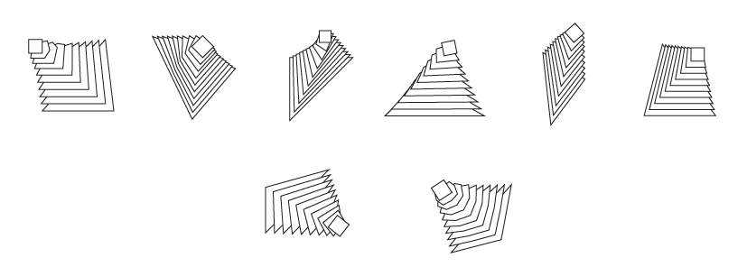
Developing a flexible visual identity system to be applied to various marketing materials proved to be the initial challenge. However, writing the narrative and finding a new meaning to the word refraction, which would symbolize students’ growth and experience, gave clarity to the visual direction. As mentioned above, the foundation for this event was the course the students were enrolled in. From there, their passion led them on different paths to different destinations - some became photographers, others motion designers, illustrators, etc.
Points that should be addressed by the visual identity system:
1. Show the foundation of this undergraduate course
2. Show the growth the students experienced
3. Show the change in path
4. Identifiable design elements for each student to represent individuals while maintaining overall consistency.


Further improvements
Although this project is a sample case study exploring storytelling, branding, and visual identity, some aspects of the event can be further developed. The following is a list of visual elements which could enhance the experience surrounding this event.
Instagram filter- this was developed but not published to not create any confusion with the actual event.
Website development to include interactive elements using JavaScript. The landing page could provide interactivity by making use of the existing shapes.
Brochure with specific shapes that would align with the rest of the event visuals.
Video projection using the same design principles and visual language.