La Belle Epoque
In the early 1900s, the owners of Café de la Belle Epoque decided to expand their offerings and convert the café into a full-service restaurant, with a rich history and deep connections to the golden age of Parisian culture. Its exquisite French cuisine, carefully curated wine list, and elegant décor make it a must-visit destination for anyone who wants to experience the beauty of French culture and cuisine.
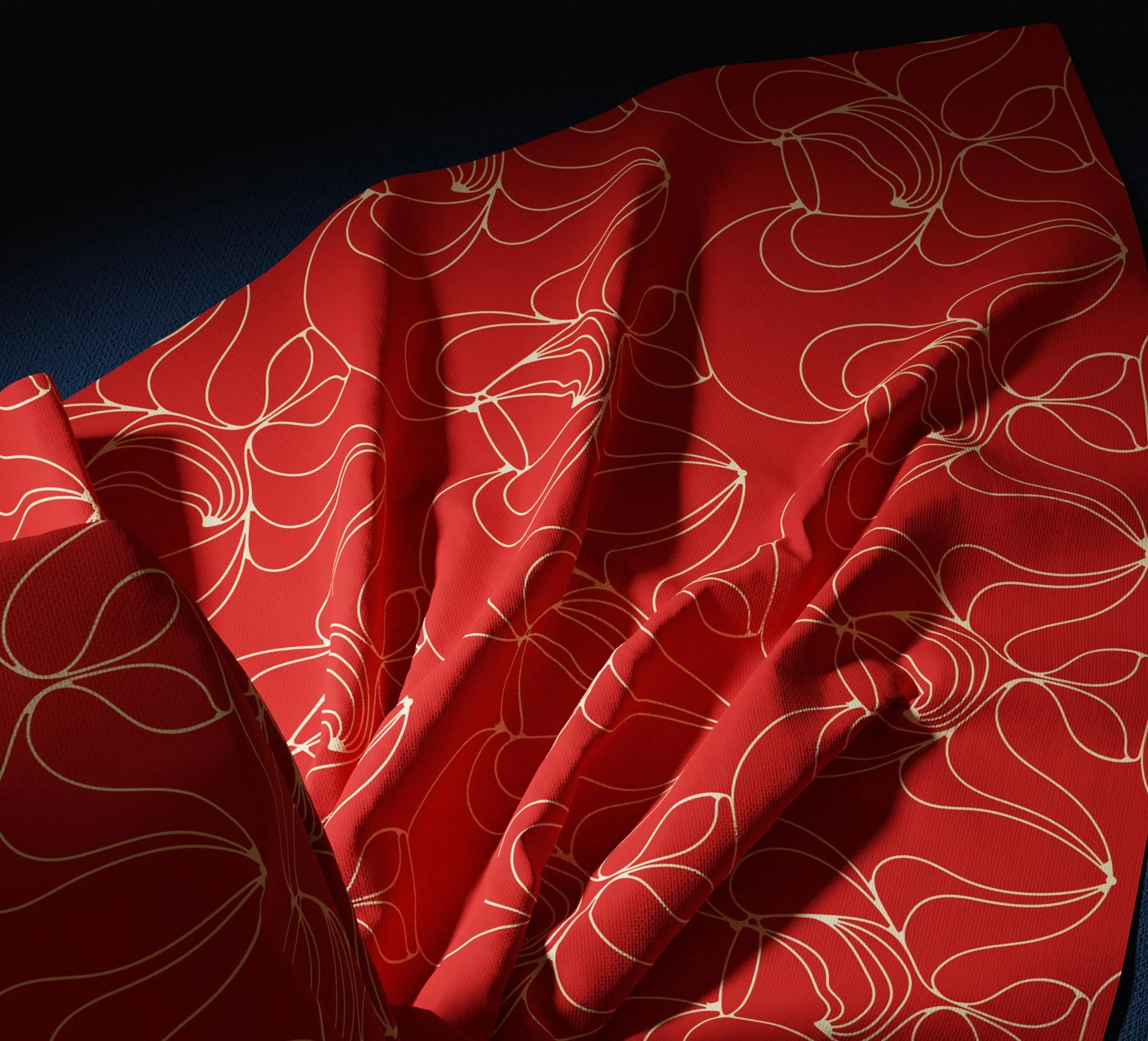
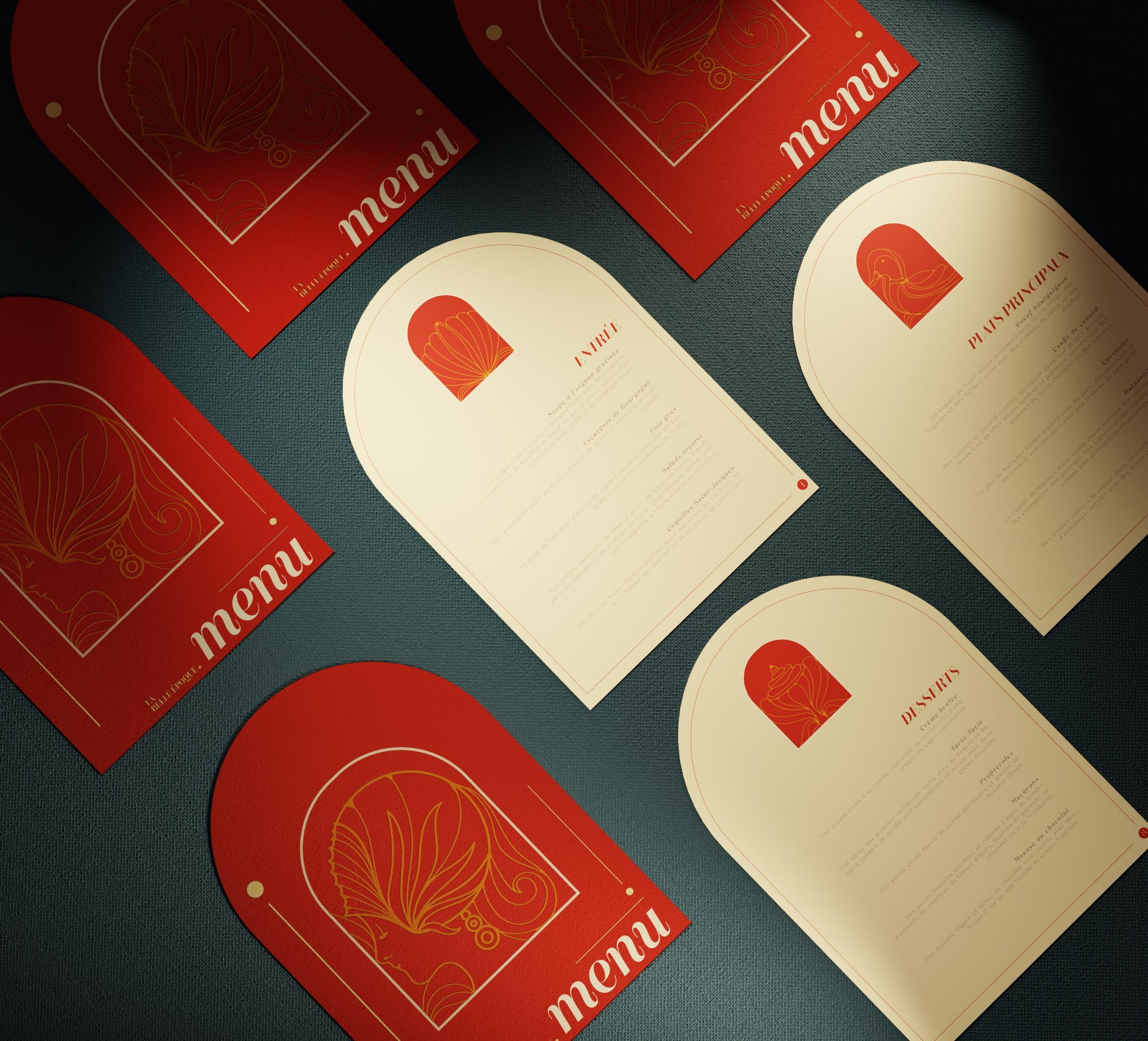
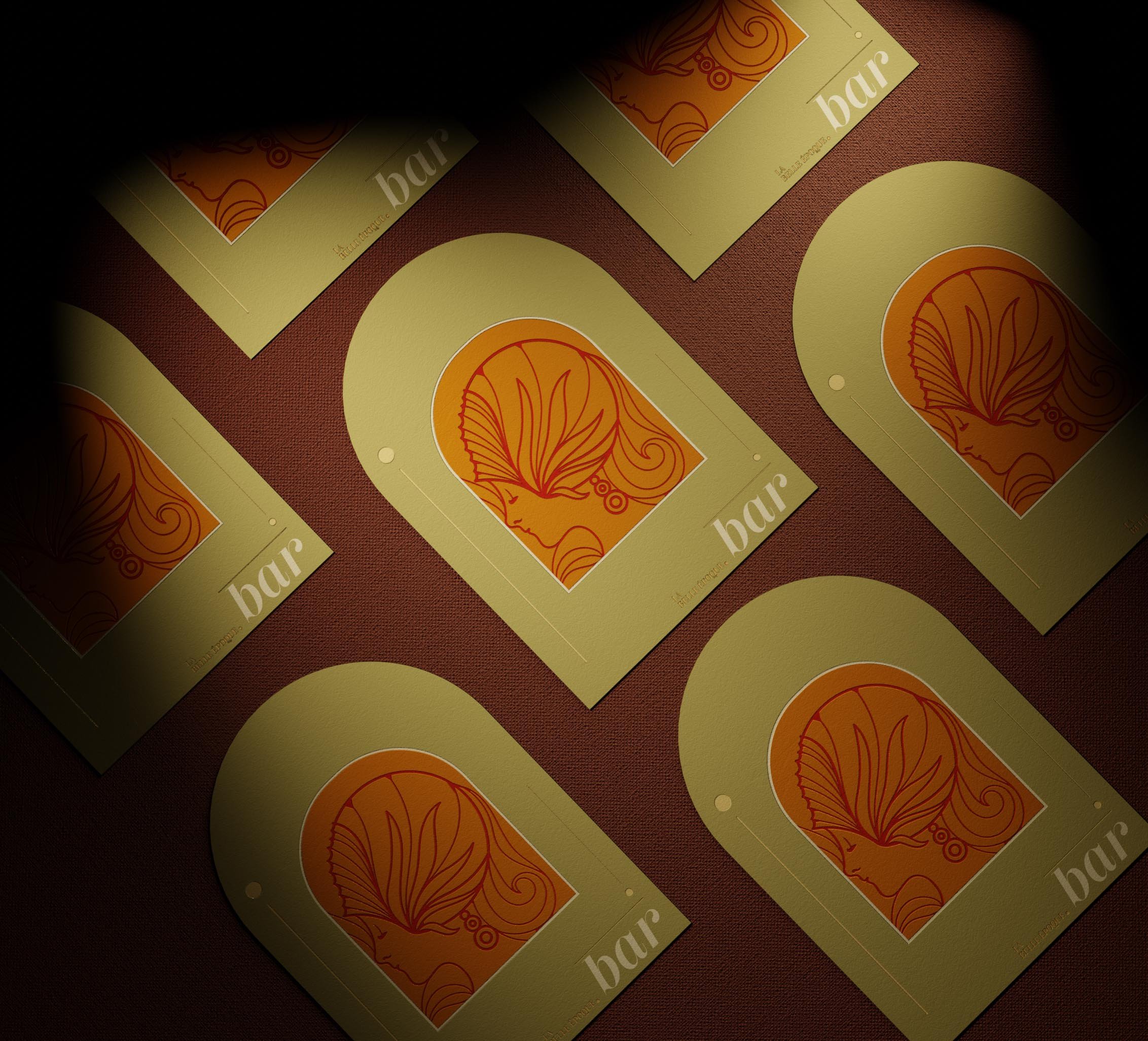
Today, La Belle Epoque is renowned for its exquisite French cuisine, carefully curated wine list, and elegant décor. The fusion of Art Nouveau and modernist elements in the décor, with flowing lines and floral motifs, pays homage to the golden age of Parisian culture. The restaurant's carefully crafted menu features a blend of traditional and modern French techniques, with an emphasis on seasonal ingredients and locally sourced produce.

Given the complex and rich history of the place, the initial step was to create a moodboard to set a clear visual direction. Mood boards can be a very effective tool for clarifying and refining ideas in a branding project. By compiling a collection of images, colors, textures, and other design elements, Mood boards can help clients and designers alike to visualize different design directions and explore various possibilities.
In the case of La Belle Epoque, the client had expressed interest in both Art Nouveau and modern design, which are quite contrasting in style. However, by creating a mood board that incorporated elements of both styles, we were able to identify common themes and develop a more cohesive vision for the restaurant's visual identity.
For example, the use of flowing lines and organic shapes is a hallmark of Art Nouveau while modern design uses geometric and straight lines. Finding ways by which this could be incorporated into the restaurant's logo and other branding elements to create a sense of continuity between the two styles was quite a challenge. Similarly, the use of a limited color palette can help to unify different design elements and create a sense of harmony across the brand.
By going through this process of exploration and refinement, we were able to create a visual identity for La Belle Epoque that draws inspiration from both Art Nouveau and modern design, while still feeling cohesive and reflective of the restaurant's unique personality and history.
The Visual Direction
The Challenge

The Colours

One of the main challenges in any branding project is to strike a balance between different design styles and visual elements. This was particularly true in the case of La Belle Epoque, where we had to reconcile the Art Nouveau style with a modern approach while incorporating visual elements of the female form and french cuisine.
Characterized by flowing lines, organic shapes, and intricate decorative elements, art nouveau is a complex visual style. It was a popular choice for many restaurants and cafes of the time, and its emphasis on nature and the human form made it a perfect fit for La Belle Epoque.
However, the challenge was to incorporate these historical design elements into a modern context. We had to find a way to make the design both timeless and contemporary, while also staying true to the history and personality of the restaurant.
To accomplish this, we have experimented with different approaches such as using stylized imagery or incorporating modern design elements like bold typography or a minimalist layout. By finding a way to blend these different design elements together, we were able to create a unique visual identity for La Belle Epoque that captured the essence of the restaurant while also appealing to a modern audience.
In the end, the success of the project came down to finding the right balance between historical and contemporary design elements. The designers were able to create a design that was both visually appealing and functional, while also capturing the essence of La Belle Epoque's unique personality and history.

The primary color palette of La Belle Epoque features a combination of deep red, ivory, cream, and black. The specific shades and tones of these colors were carefully selected to create a balance between the historical Art Nouveau style and a modern approach.
The deep red used in the color palette is a rich, warm hue that evokes feelings of passion and excitement. This color is often associated with love, desire, and romance, making it a perfect choice for a restaurant that aims to create a sophisticated, intimate ambiance. The red used in La Belle Epoque's visual identity is a dark shade that is almost burgundy, which adds an element of depth and richness to the design.
The ivory and cream tones used in the color palette create a sense of warmth and elegance. These colors are often associated with luxury and sophistication, which is consistent with the restaurant's brand. The ivory is a warm off-white hue that is soft and inviting, while the cream adds a touch of richness and depth to the palette.
Finally, the use of black in the color palette provides a sense of contrast and balance. Black is a classic color that is often associated with sophistication, elegance, and power. In La Belle Epoque's visual identity, black is used sparingly to create a sense of contrast and balance with the other colors. This adds a modern touch to the overall design and helps to create a sense of depth and complexity.